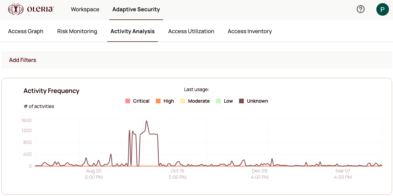
The Activity Analysis dashboard gives you a breakdown of active and dormant accounts for a selected application, so you can quickly see where usage is concentrated and where access may have gone stale.
The dashboard contains two sections: an account utilization chart and a detailed activity table. You can set a custom date range to focus on a specific period.The account utilization chart breaks down accounts by their active vs. dormant status for the selected application. This makes it easy to see how many accounts are generating activity and how many have gone unused - a quick proxy for over-provisioned access.The activity table lists individual events logged for the application, with each event tagged by severity:
Select an application from the top of the page to load its activity data. Adjust the date range to narrow the view to a specific period - for example, the last 30 days during an investigation.Use severity as your first filter. Severe and high events are your starting point for any investigation. Once you have identified accounts generating high-severity activity, select an event row to open the activity details view for the full context of that event.To see how active access looks overlaid on the Access Graph, see the activity overlay.